Folly Theater critique #2
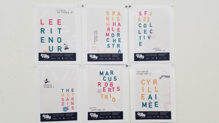
Moving forward from the initial posters shown ~here~, I didn’t want to completely restart my project. For this round, I took out the cliche and unnecessary imagery, completely re-did the type treatment, and simplified my composition. Overall I like where this is going, and am looking forward to printing a draft at full scale (34×50).
I am having trouble with the symbolic imagery in my posters. I want to represent the artists in a unique way, but right now it does not make sense to the viewer.
Questions I’m thinking about/hope to discuss:
— Is this conflict ok?
— How will the audience make a connection?
— Are my references too random?
— What other symbols could I use to portray an artist’s personality, style, etc.?