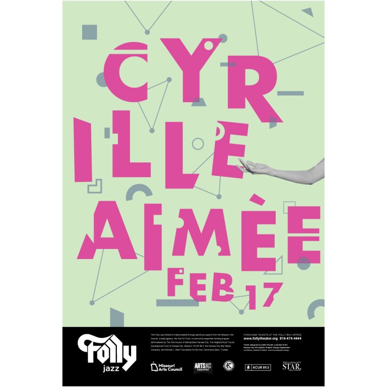
To me, jazz is expressive, spontaneous, and passionate – exactly what I want my viewers to think of my jazz posters. Because the target audience of this project was younger adults and millennials, I wanted to put a contemporary twist on traditional jazz by using bold colors and abstract, simplified shapes. Several of the visiting artists are doing just that in their music.
Instead of illustrating the artists’ physical form, I wanted to find a way to visually represent sound and music. After doing a bit of research, I found several composers who wrote scores in unique ways that didn’t use traditional music notation. Most examples included basic geometric shapes to symbolize sound. The patterns and forms used instantly reminded me of letters and how type is constructed. By integrating the music shapes and typography, it created an interesting play on bridging visual sound and language, as music is a language in itself.
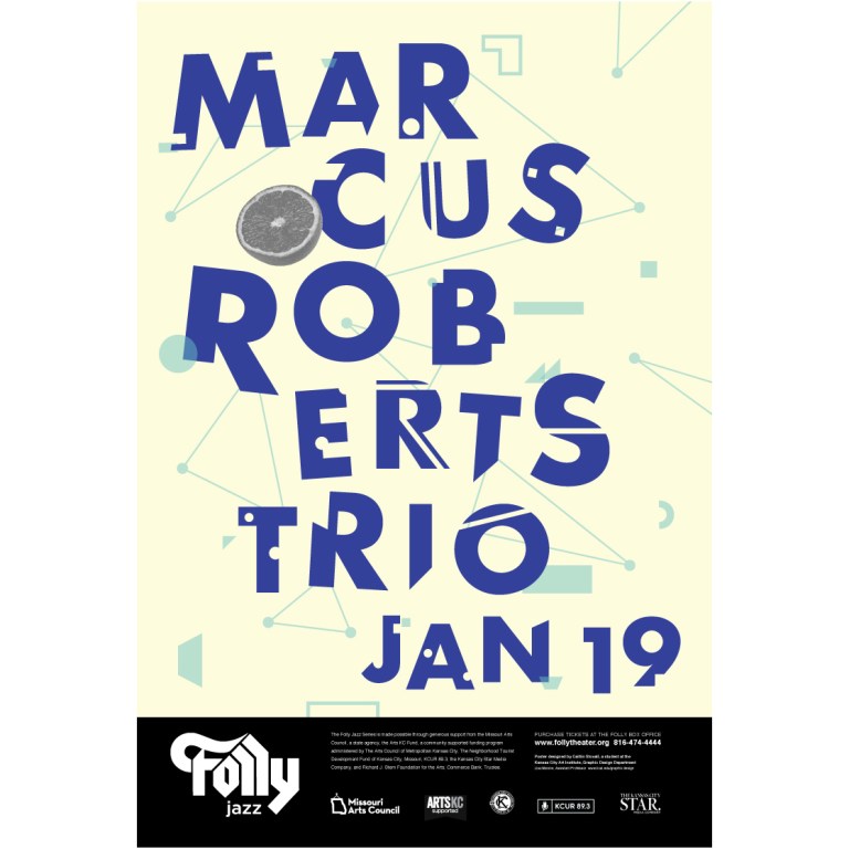
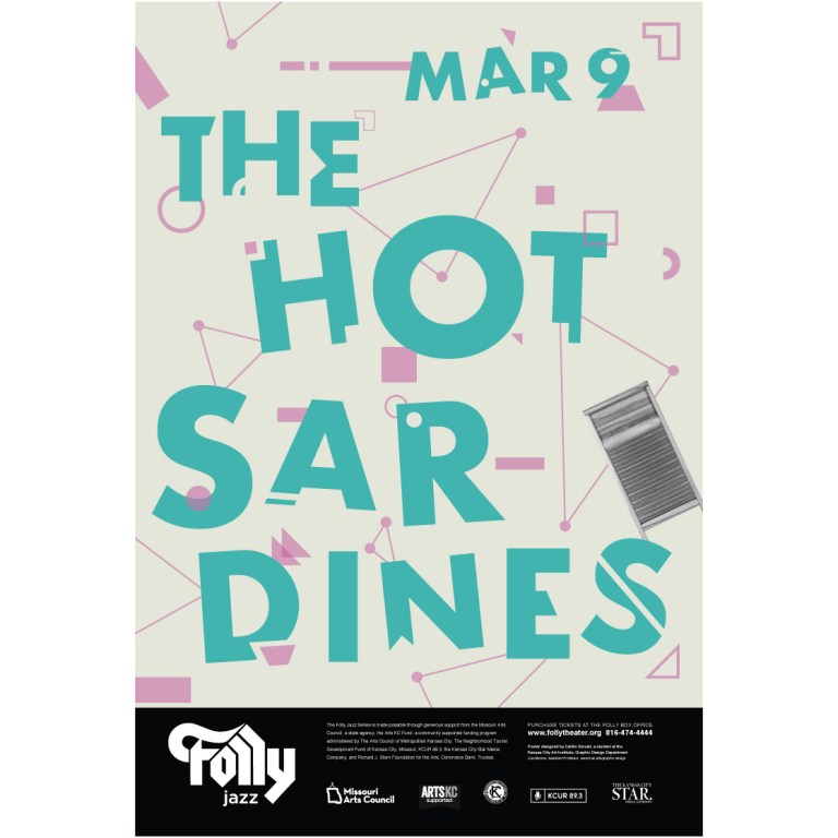
While all six of the artists have a lot in common, it is important to keep in mind how they stand apart from each other. Every poster has an icon to reference the artist, such as an orange for Marcus Roberts Trio (symbolic for Jacksonville Florida, Roberts’ hometown), or a washboard to hint at The Hot Sardines’ unique instrumentation.
Overall, I am happy with how my posters turned out. I made a ton of great progress along the way and invested so much energy and time into making them. Excited to visit the Folly again as an audience member to see some of the jazz artists!