The website I evaluated for this exercise was when2meet.com. I chose this site because I hadn’t heard of it/used it before.
 Screenshot of home page.
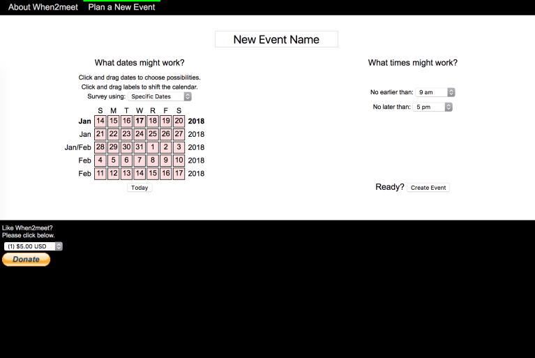
The first thing that caught my eye on this page is the red calendar object. From there, I read the header “New Event Name” and the “What times might work?” text. Without any other prompts or clear instructions, I was confused on the website functions. I selected a range of dates from the calendar, made an event name, and created the event. From there, I input my name and was taken to this screen:

This screen was overwhelming and confusing! Eventually after messing around on the graphs, I figured out how the toggles work and how to add my “availability” for this potential meeting. I can invite others to add their availability via email, facebook, or hyperlink. When others add data to the calendar, it appears on the right.
As a first time user, I would have benefitted from some initial instruction or overview. Under the “About When2meet” tab lists information and a video tutorial. The simplicity of the website is appreciated for the complicated information, but was hard to navigate. I can see how a function like this could be useful, but seems complicated for a group of people to understand efficiently.
